HideSeek Chicago
HideSeek Chicago had an updated look, while maintaining the feel of HideSeek Toronto. While I worked on the branding refresh and new room concepts, I also continued to develop the language of the brand. To view the HideSeek Toronto project, please go here.
Concept / Copywriting
Tag line Collection
Building on a few iconic tag lines from HideSeek Toronto, I continued to develop this collection of words and phrases to help convey the spirit and attitude of HideSeek. These tag lines were used throughout the exhibition, on merch and apparel, as well as social media and marketing materials.
Exterior Window Wrap
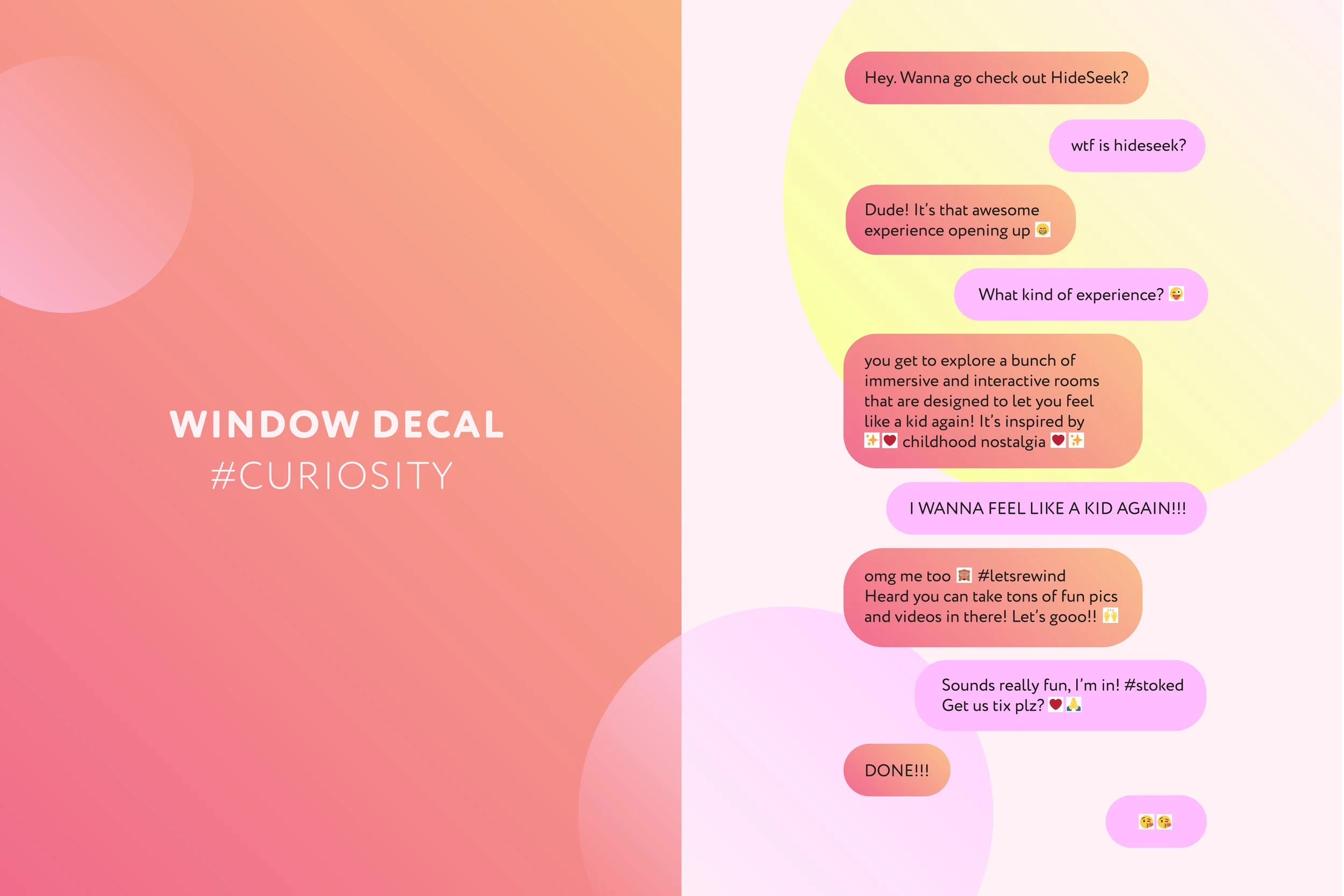
Since HideSeek was new to Chicago (and the US market as a whole), there was little public knowledge or understanding of it. While the exhibition was under construction, we decided to take advantage of the street-facing windows of the venue, and use decals in the form of a casual chat conversation between two friends to inform and peak the curiosity of those passing by.
Hidden Tickets Campaign
To generate some hype around the opening weekend of HideSeek Chicago, we ran a social media-driven campaign where a total of 30 tickets were hidden at various locations around Chicago. We posted hints on Instagram of where they could be found.
The HideSeek Look
This copy was written specifically for the HideSeek web store. However, the headline was also used in the physical store at the exhibition, near the mirrors where customers could try on the clothing.
The New Rooms
* At HideSeek Toronto, the Rad Ride room was done in partnership with General Mills, where we used boxes of 2 existing cereal brands. For HideSeek Chicago, we opted to design our own cereal boxes and have some fun with the packaging copy.
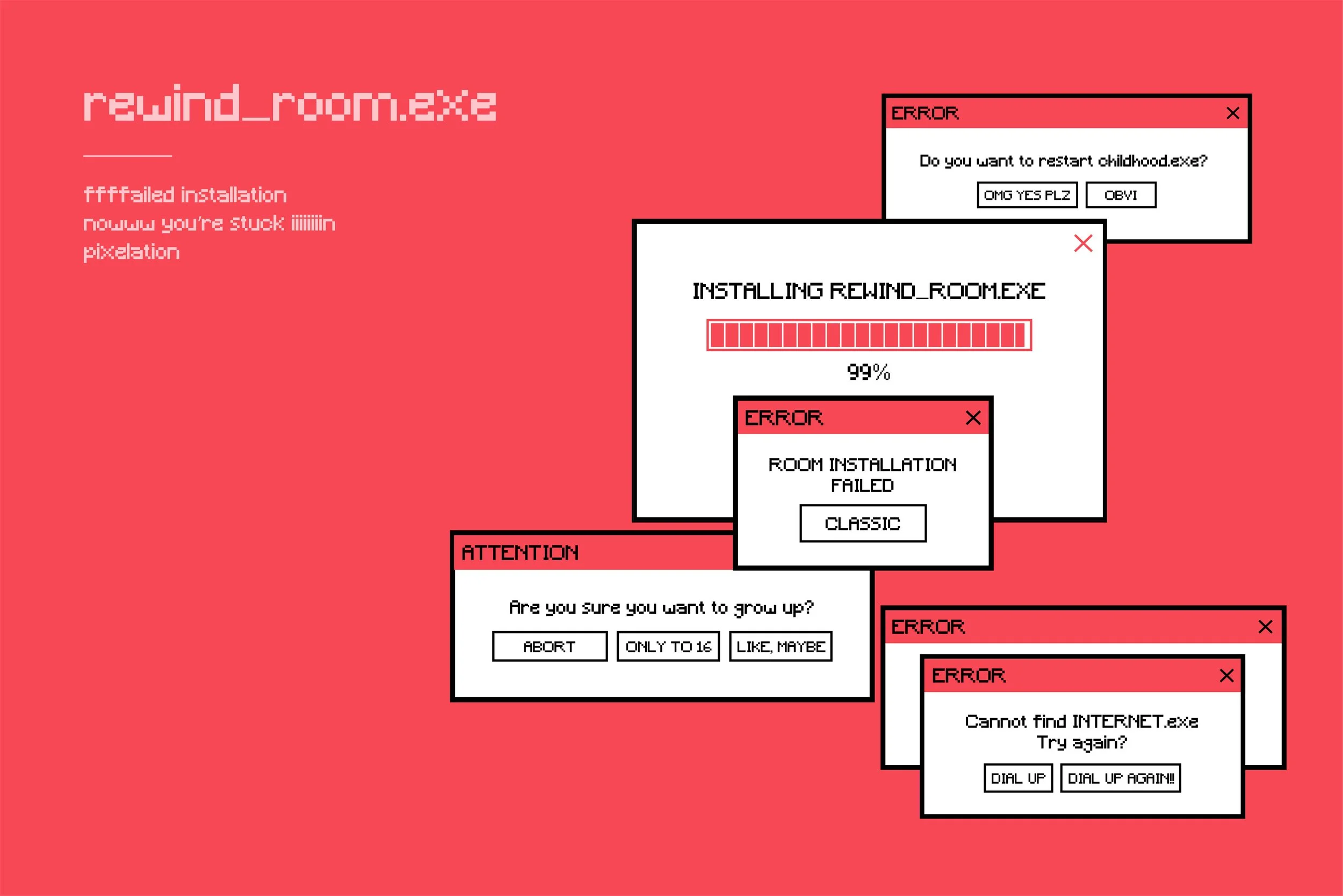
* While we kept some elements from the original Rewind Room, we wanted to bring in a nostalgic digital vibe to this room, reminiscent of the early 90s era computers. Upon entry, a large ‘room installation failed’ sign was displayed, followed by other on theme error messages.
* This room needed some cheeky writing, reminiscent of Sharpie doodles on the back of the school bus seats. Inspired by the iconic childhood nursery rhyme “Wheels on the Bus,” we decided to put our own contemporary spin on it.
Washroom Signage
HideSeek always aims to make every inch of the exhibition fun, and that includes the washroom area. For the Chicago exhibition, a light-hearted, humorous little rhyme was displayed along with other signage in the washroom vicinty.


