Vika Vine Photography Rebranding
Brand strategy / Visual identity / Art direction / Tag line writing / Copywriting / Graphic design

Intro —
Vika is a talented Toronto-based photographer, who specializes in branding and social media photography. Prior to us working together, Vika’s brand was a true mosaic of visual styles. She was using a large and complex illustration as her logo, which lacked the clarity and scalability needed in a logo. She was also using many different colours and fonts, both on her website and in her branded materials. Overall, her visual identity was lacking cohesion and failing to accurately reflect her professionalism and skill level.
Vika was also struggling to articulate her offerings and clearly convey her services to her clients. Her website was confusing, difficult to navigate, and lacked organization. After a deep dive into brand strategy - where we looked at every aspect of her brand’s core and analyzed her ideal customers’ demographics and psychographics, it became clear that both branding and social media share a hefty goal: influence. Ultimately, this is what her clients were after. I wanted to start the rebuild of Vika’s brand around a tagline that immediately conveyed what she did and separated her from the pack. And so it began… Vika Vine, Images with Influence.

More than a photo —
One of Vika’s pain points was that she was often undercharging because her clients assumed she was just ‘showing up to snap and go.’ Both herself and her clients were only factoring in her shooting and editing time. However, Vika did so much more for her clients. Prior to a project, she would send them in-depth questionnaires and arrange phone meetings to plan out every aspect of the shoot. She guided the strategy of the project, provided detailed art direction, styling and prop suggestions, and did location scouting. She provided robust mood boards and posing inspiration for every client. This detailed process is what separated her from other photographers and what made her results superior. I had to ensure that all these skills were clearly highlighted in her rebrand. I wanted to make sure her prospective clients understood from the start that they are getting so much more than a photoshoot when working with Vika. Positioning herself in this way also allowed Vika to start charging more for all the value she was providing beyond a time investment.

Organization meets articulation —
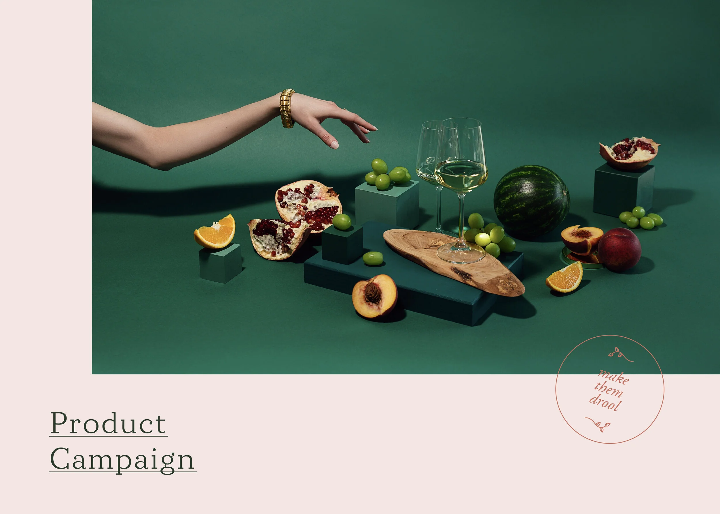
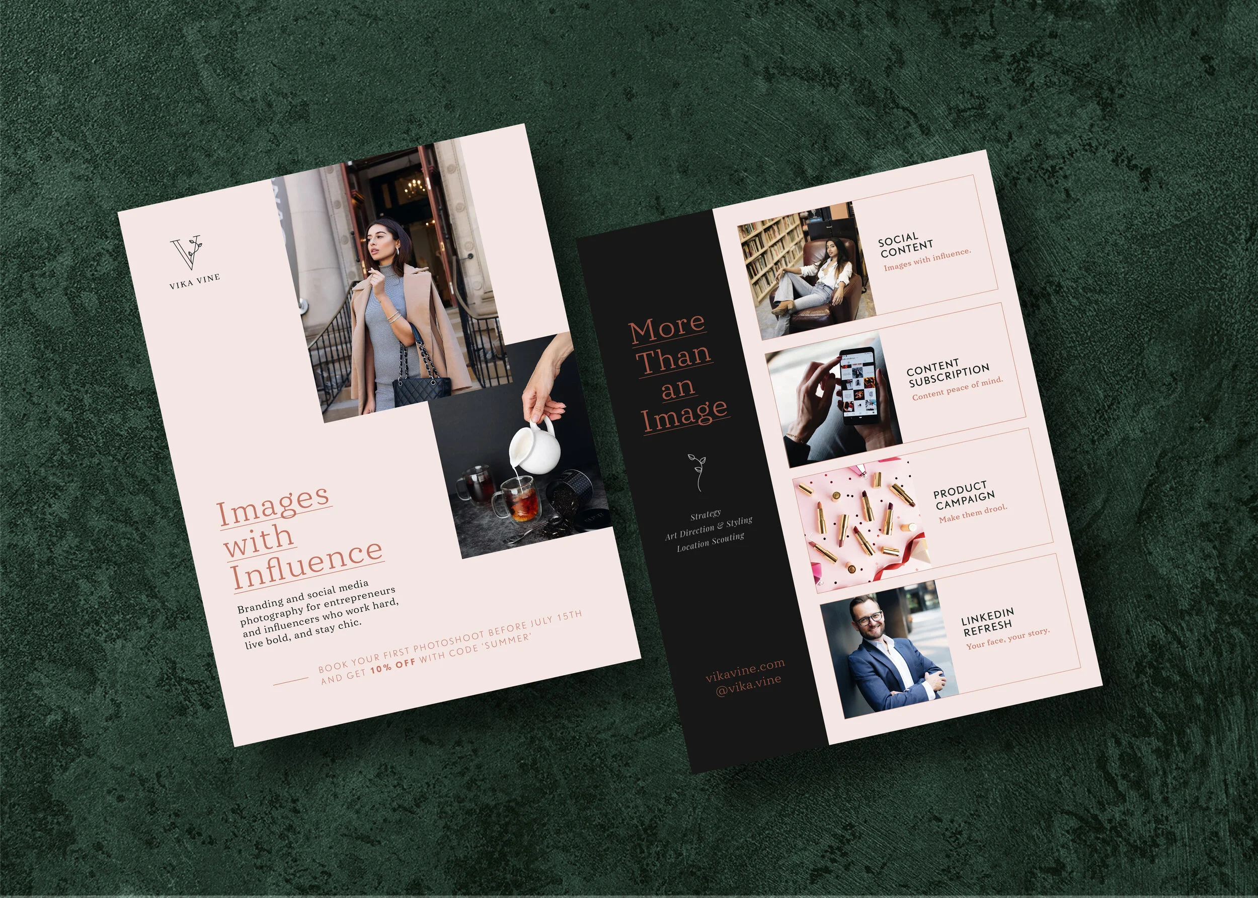
On Vika’s old website, it was hard to keep track of her services. They were not only lacking organization, but it was also not clear what benefits each one of her service brought to her clients. We had to fix this. After some time making lists and drawing arrows and containers on a giant white board, we were able to neatly organize her services into 4 clear categories: social content photography, a content photography subscription, product photography, and LinkedIn portraits. I then wrote short descriptions and corresponding taglines for each of these services. Once the organization and copy were in place, I then shifted my focus to the accompanying imagery. Since Vika is a photographer, it was important that her brand photography was in line with her new visual identity. Each service now had to have its own ‘cover shot,’ which I art directed. The mood, colours, props and overall aesthetic were all carefully selected to align with her new look and vibe, as well as to visually convey each service.


The Content Walk —
Vika also organized and hosted ‘Content Walks,’ where she would take a group of business owners around the city and take their photos. Here, too, I felt it was important to clearly articulate all the perks one got beyond fresh photos. The content walk provided networking opportunities, as well as valuable ‘take home’ photography knowledge.


Visual identity details —
In order to attract her ideal clients, Vika’s visual identity needed to feel more upscale and refined, while still warm and approachable. Her new colour palette of pale peach and warm burnt sienna beautifully balance the deep, luscious green and black.
For her logo, incorporating a vine felt like a natural direction. This elegant detail reflects Vika’s own attention to detail, while also communicating growth - something important to both herself and her entrepreneurial clients. The vine also appears as a graphic detail around edges of photos, or as a subtle background detail on brand collateral.
To allow Vika full flexibility when using her logo, I put together several variations for her to choose from and use as needed.


Getting it out there —
Lastly, I designed Vika an elegant community flyer and business cards, so she could experience her brand in the non-digital world as well, helping her building awareness and gathering new clients.

Read Vika’s testimonial here.